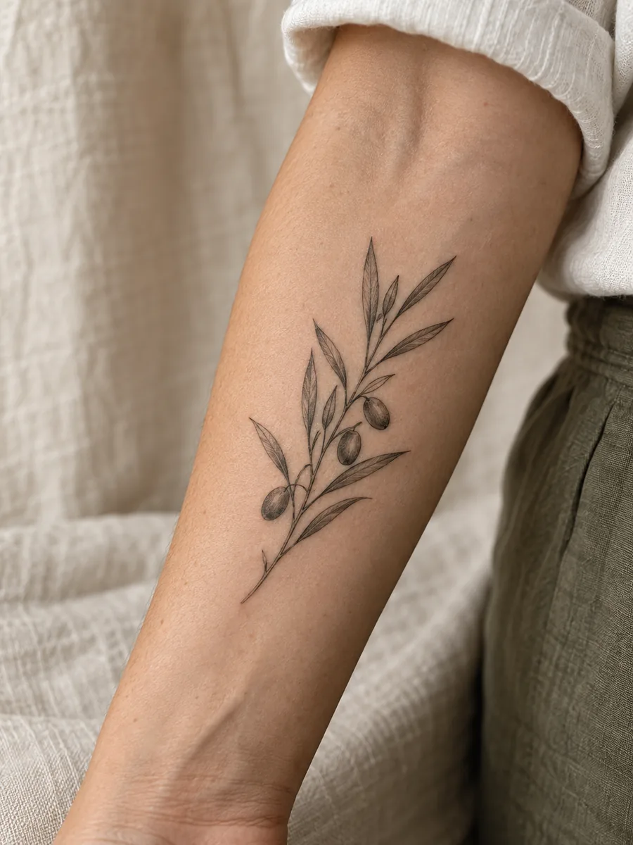
An olive branch tattoo is built from a simple relationship: a stem gives the design direction, and the leaves decide how light or dense it feels. You can change its character without adding another symbol or making the tattoo much larger.
Start with the part you like most. Is it the long narrow leaves, the bend of the branch, or the open skin between them? That answer makes a more useful artist brief than asking for a generic delicate botanical tattoo.
Seven compositions to compare
1. A single upright sprig
One stem with a few leaves creates a clear vertical shape. It can sit along the forearm or upper arm without needing a frame. Vary the leaf angles slightly so it feels like a plant rather than a row of identical marks.
2. A gently curved branch
A shallow arc introduces movement. Let the largest leaves sit near the middle of the curve and leave the tip lighter. Compare the arc with your arm relaxed; a graceful drawing on paper may look different when it follows a rounded surface.
3. An open wrist cuff
Two ends that stop short of touching create a bracelet impression without a closed ring. The gap is intentional: ask your artist to place it where the composition looks balanced from more than one angle. Plan around a watch or bracelet you wear often.
4. Two unequal branches
A longer branch and a shorter companion can form an open V. Keeping the stems unequal avoids a rigid emblem-like appearance. Leave a clear gap at the top instead of adding enough foliage to close every opening.
5. A short diagonal sprig
A diagonal can feel informal and work well as a small accent. Check its relationship to neighboring tattoos and clothing edges. If you plan a collection, leave room for the next piece rather than treating the remaining skin as an afterthought.
6. A branch with one olive
A single oval fruit can make the subject more specific. Give that oval enough space to read separately from a leaf. Several tiny fruits may become visual clutter if the overall tattoo is small.
7. A branch beside a personal initial
Keep the lettering separate from the stem. A small gap allows each element to stay legible, while the branch frames the initial. Ask whether your chosen letterform still reads at the intended size; do not shrink the whole composition just to match a reference.
Fine lines still need a clear hierarchy
The stem, leaf outline, and interior leaf marks do not have to be equally prominent. A slightly stronger main stem can anchor a delicate drawing. Some leaves can stay unfilled; others can use a small area of shading. Ask your artist how they would translate the drawing into tattooable linework.
When comparing references, look at the gaps as carefully as the ink. Crowded leaves make a branch read as one dark strip. Fewer leaves with room between them can communicate the subject more clearly.
Choose placement by the branch’s direction
A long sprig naturally suggests the length of the forearm. A shorter arc may suit the upper arm. A cuff needs to be checked around the wrist, where one straight-on view cannot show the whole design. Use stencil views from the front, side, and your own perspective before deciding.
Meaning without a borrowed story
If the branch represents reconciliation or a personal fresh start to you, explain that to your artist. Your reason does not have to match someone else’s interpretation. For a culturally or religiously specific reference, research its context rather than assuming every botanical emblem has the same meaning.
Bring a brief that names the leaf shape, amount of shading, approximate space, and anything you do not want. Browsefloral compositionsfor structure ideas andarm and wrist designsfor placement comparisons.