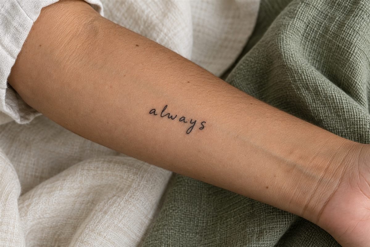
Handwriting carries small irregularities that a standard font does not: an unusual loop, a leaning letter, or a gap between words. A handwriting tattoo can preserve those details, but it helps to decide which ones matter most before the artist adapts the reference.
Choose a clear source
Use a sharp scan or well-lit photograph of the writing. Keep the camera square to the page so the letters are not stretched by perspective. Preserve the original file and bring a copy; do not rely on a compressed screenshot if a better source exists.
Make sure you have permission to use someone else’s writing where appropriate. Avoid exposing private messages or identifying information merely to obtain a design reference.
Select the words before the style
A short phrase may be easier to place than a whole sentence, but shortening it can change its meaning. Check spelling, punctuation, and whether the extracted words still sound like the person who wrote them.
If the phrase uses a language you do not know, have the text and meaning checked by a fluent person. Decorative appearance is not enough to verify wording.
Preserve character while allowing practical changes
Ask your artist to identify tight loops, touching letters, and unusually thin connections. You may decide to open a gap or increase the size while keeping the overall rhythm. A faithful reference does not require every tiny paper mark to become a tattoo mark.
Do not silently combine letters from unrelated sources and present the result as an untouched original note. If the design is reconstructed, understand and approve that choice.
Compare orientation and scale
Print the phrase at actual size and view it from a normal distance. Near the wrist, decide whether it should read to you or to someone facing you. On the forearm, check how the baseline appears with your arm relaxed rather than held flat for a photograph.
Long phrases may need a different placement or arrangement. Shrinking the letters is not the only way to make a sentence fit.
Proofread the final stencil
Read every word slowly before tattooing begins. Compare the stencil against the original, check the direction, and ask about any changed letterforms. Treat this as a separate step from deciding whether the placement looks good.
The image here is an imagined lettering concept, not handwriting attributed to a real person. For your own piece, the source and its meaning deserve as much attention as the linework.
Browsemeaningful tattoo ideasfor other personal references. If you prefer a symbol to words, compare the simpler silhouette of acrescent moon tattoo.